Did you know that everything in design has meaning — even the shapes you use? Design is a visual language that sends messages to your target audience — no words necessary — and even the shapes you use contribute to that message.
In fact, shape and form have been carrying meaning for centuries! Visual language was used for storytelling, guidance, and learning for early humans before spoken language evolved, and we continue to understand messages relayed through visual communication to this day.
Whether it’s adding playful circles to the background of your latest social media post, or designing a logo that matches your company’s personality, shape symbolism can help guide the choices you make when communicating with your audience.
The result? A clarified message that sparks an emotional connection and reaction — all without saying a word!
In this post, we’re going over the three categories of shapes. We’ll also talk about shape symbolism and the meaning of shapes in design. By the time you finish reading this article, you’ll never look at a triangle or a square in quite the same way again!
Three Categories of Shape in Design
Shapes in design are categorized into three main types: geometric shapes, natural (or organic) shapes, and abstract shapes.
Each of these three basic shapes groups and their meanings bring something very different to a design and suggest something subliminal about the brand or company using them.
In the following sections, we’ll define the three categories, and overview different shapes and their meaning and symbols in each!
Geometric Shapes
Geometric shapes are any shapes that are based on mathematical principles such as triangles, squares, circles, and polygons. Geometric shapes have clear, perfect edges that are usually made with tools.
You usually don’t find a perfect circle or square in nature — that’s what marks the difference between natural and geometric designs.
So what do geometric shapes mean? The answer depends on the particular shape. Below, we’ll discuss some common geometric shape meanings behind the most popular shapes you might see in design!
Triangles
To understand the triangle shape meaning, it helps to look at a triangle itself and how it’s positioned. A triangle is stable when sitting on its base, and unstable when it is on its side or inverted.
Depending on how it is positioned, a triangle represents stability and instability, an inherent tension throughout the design. It suggests action, movement, and in some cases aggression.
Triangles in graphic design stimulate movement and help with progression and purpose. One of the most well-known examples? The “Play” button! It’s simply a triangle turned sideways, but it has a universal meaning: press to continue.
Rather than establishment and stability, triangles suggest growth, progress, and movement.
Squares and Rectangles
Squares symbolize order, trust, stability, and being grounded.
One of the most familiar geometric shapes in design, squares and rectangles are used to organize and define a design, adding comforting structure along the way.
What the square represents might come across as boring, but it also inherently establishes trust and security in the viewer.
Circles and Ovals
Circular shapes, oval shapes, and round shapes have meaning in graphic design.
While the triangle can be seen as masculine, circles are considered a more feminine shape.
Their rounded curves are graceful, feminine, and warm.
They are often used in graphic design to represent familiar objects like wheels, fruit, the sun, eggs, and more!
Organic Shapes
Organic, or natural, shapes in design are associated with nature. In other words, they often look similar to things found in nature like plants, animals, and rocks. They tend to be characterized by curving lines and a lack of symmetry. Unlike geometric shapes, organic shapes look far less solid and precise without stiff corners or straight lines.
Organic shapes have meaning in design that may differ a little bit depending on the particular shape you’re using.
For example, if you use a wave shape in your design, your viewer will probably associate it with freedom and flow. If you use a leaf or a flower shape, your design might evoke the feeling of nature and delicacy.
Abstract Shapes
When you hear the term abstract shapes, you might think of abstract art and curving shapes that don’t really look like anything in particular. You’re probably thinking of organic shapes, which we covered above.
It’s a mistake many people make, because abstract shapes — and even abstract art — are all about interpretation. It doesn’t actually matter if the abstract shape looks more organic or geometric; it’s more about the process and the context behind it.
A good example of an abstract shape is an icon. For example, on our Tailwind dashboard there are several icons on the left navigation menu. These are all abstract shapes that reference what is in that menu tab.
You can return to the home screen by clicking the symbol that looks like a home. You can create social media designs by clicking the paintbrush icon.
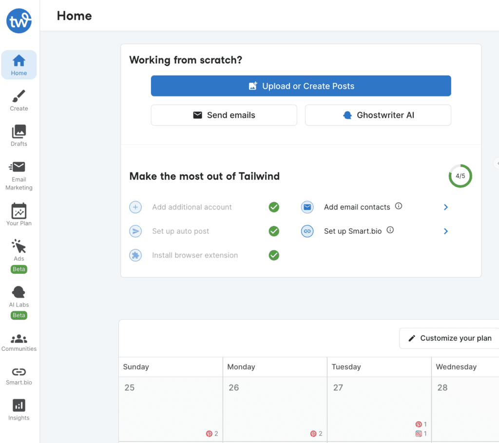
Although abstract shapes often have geometric lines in them, they are abstract because they symbolize or reference something else that depends entirely on the context of their use.
Want to learn more about the nuance of abstract shapes? The design of the Olympics pictograms can give you insight into this process!
Using What Shapes Represent in Business and Branding
Now that you have an idea of what shapes represent to viewers, you can apply this knowledge to visual design in your business! From logo design to social media, you can perfect your message both on the surface and subconsciously with a few smart choices in the elements you use.
Colors also play a key role in the psychology of design. Just as the meaning of shapes in psychology creates an emotional reaction, so do the colors you use! For example, you might use a yellow circle to associate with the sun, or a pink half-circle to associate with summery fruit like watermelon.
Tailwind Create makes it easy to ace your first impression on social media with template designs that speak to your individual audience and match your branding! Want to start from almost done with breathtaking social media designs that speak to your audience in every possible way? Try Tailwind Create!


