If you’ve ever walked into a room painted yellow and felt anxious or gazed at a blue painting and felt calm, you aren’t imagining it.
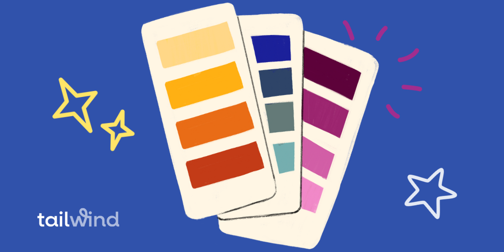
Studies of color psychology tell us that individual hues evoke emotions. The power of color isn’t limited to paint; different tones can also be used to set the stage for a brand’s style, and even to build brand awareness!
Whether you’re a new business owner looking to build a strong brand or a marketer hoping to learn how to leverage this tool, color psychology marketing can be an unexpected resource!
In this article, we’ll take a look at what color psychology is and how it fits into a marketing strategy.
You’ll learn how to use color psychology to build brand awareness.
And finally, the power of some of the most popular brand colors you might choose from.
What is Color Psychology?
Color psychology is the study of how colors affect human behavior and emotion.
It’s widely believed that the ability of colors to evoke certain emotions is linked to memories that we have of those specific tones from throughout our lives.
For instance, because most people find the ocean and other bodies of water calming, the color blue is often associated with feelings of tranquility and stability.
The Historical Journey of Color Psychology in Marketing
Delving into the vivid world of colors and their influence on our psyche isn’t just a modern-day marketer’s fascination. Its roots stretch into the distant past. A look at that history can help us understand color psychology (and human behavior!).
1. Whispers from Ancient Epochs: The cradle of civilization wasn’t colorblind. The pharaohs of Ancient Egypt, for instance, didn’t randomly choose hues for their majestic palaces and intricate jewelry. Colors were emblematic, carrying profound symbolism. Gold echoed eternity and divinity, while blue mirrored the celestial heavens and the vast Nile.
2. The Dawn of Consumerism: Fast forward to the Industrial Revolution, an era that altered production and consumption. As factories churned out myriad products, packaging and presentation gained prominence. It wasn’t just about ‘what’ you were selling, but ‘how’ it looked. And colors began to play a pivotal role in making one product stand out from another.
3. The Golden Age of Advertising: Come the 19th and early 20th centuries, newspapers and magazines were awash with advertisements. The black and white era gave way to a riot of colors. Savvy advertisers of the time realized the immense potential colors held.
4. Branding’s Vivid Canvas: As we stepped into the latter half of the 20th century, branding became the buzzword. Companies weren’t merely selling products; they were selling experiences, emotions, and identities. Coca-Cola wasn’t just a soda; it was an emotion wrapped in its iconic red, signifying warmth, joy, and celebration.
5. Navigating the Digital Seas: The rise of digital marketing brought new challenges and opportunities. The age-old principles of color psychology were now applied to pixels and digital designs. The color of a website’s ‘Buy Now’ button wasn’t a mere design choice; it had direct implications on click-through rates and conversions.
6. A Global Palette: As businesses ventured beyond borders, the color map expanded. The realization dawned that colors weren’t universal in their symbolism. The purity and innocence of white in Western ethos might translate to mourning in the East. The global marketer had to be a cultural connoisseur, understanding the kaleidoscope of color interpretations across the globe.
Color psychology in marketing isn’t a fleeting trend. It’s a timeless principle, evolving and adapting, yet consistently holding a mirror to human emotions, perceptions, and behaviors. As marketers, understanding this rich tapestry offers not just a glimpse into the past, but invaluable insights for the future.
Where Does Color Psychology Fit Into Marketing?
The goal of effective marketing is to create an instant connection with an audience and to begin to build brand awareness and loyalty from the start. Color psychology plays a big role in accomplishing this!
The colors we use to bring our logo and advertisements, websites, and other marketing tools to life send a subtle, yet powerful message. Without consciously recognizing it, customers are already making assumptions about the style and tone of a brand simply based on color.
Brands can choose strategic placements and groupings of colors to connect with the audience and inspire them to action.
Primary colors can be used to convey the overall traits of the brand. Secondary colors can be used to evoke emotion or spur an action, such as highlighting a button on a web page urging new customers to join a mailing list!
Understanding the psychology behind certain colors will allow you to build audiences and even drive sales.
Related Reading: Styling Your Brand with Seasonal Color Theory
Color Psychology Chart: Emotions and Effects Decoded
To help you begin to put the power of color psychology to work, we’ve compiled a list of some of the most common colors and the emotions they may evoke.

Red Color Psychology
Red is one of the most popular colors used in marketing brands — and for good reason.
This powerful tone evokes a number of strong emotions and is used by brands to represent characteristics like:
- Courage
- Boldness
- Action
- Passion
The color red brings to mind the passion of Valentine’s Day, the joy of Christmas, and even signifies luck in Chinese culture.
Brands looking to showcase these characteristics by using red in their logos include Netflix, YouTube, and Time magazine.
Studies have also shown that seeing red speeds up our blood flow, which in turn speeds our metabolism and makes us hungry.
So it should come as no surprise that brands like McDonald’s, KFC, and Coke utilize this tone.
Pink Color Psychology
While it hasn’t always been the case, the color pink has been associated with femininity for over a hundred years.
Today, brands utilize the tone when they want to express characteristics like:
- Gentleness
- Love
- Immaturity
- Affection
Brands looking to connect with female audiences and invoke youthful playfulness may use pink in their marketing.
Victoria’s Secret, and especially their sub-brand Pink, as well as Barbie both utilize pink.
As the shift away from gender roles continues, other brands, like Lyft, Dunkin’ Donuts, and Instagram have also begun to utilize different hues of pink in an effort to connect with characteristics beyond femininity.
Orange Color Psychology
Orange is a color popularly used to represent characteristics such as:
- Creativity
- Adventure
- Enthusiasm
- Friendliness
Orange is known for capturing our attention, which is why it’s often used for road signs — especially in construction zones or for hazard warnings.
Brands that use orange to grab customers’ attention and inspire creativity or adventure include Harley Davidson, Home Depot, and JBL.
Yellow Color Psychology
While studies have shown that the hue can evoke feelings of frustration or even anger, when it comes to branding, yellow is more often seen as a cheerful color.
Companies may use yellow when they want to express feelings of:
- Happiness
- Positivity
- Optimism
- Summer
Brands that use yellow as a primary color in their marketing include McDonald’s, Ikea, and Snapchat.
Green Color Psychology
The many emotions evoked by the color green are usually attributed to our relationship with the natural world.
Much the same as a walk outdoors can make us feel calm, the color green in marketing can evoke a sense of:
- Growth
- Generosity
- Health
- Fertility
John Deere and Animal Planet both use green to signify their connection to nature.
Brands like Starbucks, Spotify, and Whole Foods use it to evoke other emotions.
Blue Color Psychology
If you want to inspire loyalty and bring patrons back to your storefront, it’s better to paint the storefront blue instead of orange.
Research shows that customers are 15 percent more likely to return to a store when it’s painted in the cool hue rather than the harsher warm color.
Besides loyalty, other characteristics brands can express include with the color blue include:
- Stability
- Peace
- Calm
- Trust
A few brands that use blue to express these emotions include Ford, Facebook, and American Express.
Purple Color Psychology
Long considered the color of royalty, purple continues to evoke regal vibes in modern marketing.
The color purple can be used to showcase brand characteristics like:
- Luxury
- Wisdom
- Power
- Spirituality
Brands putting this powerful color to work to evoke feelings of power and luxury include Yahoo, FedEx, and Roku.
Brown Color Psychology
Much like green, brown is a natural tone that evokes stability. Other characteristics brown can be used to express include:
- Reliability
- Strength
- Dependability
- Earthy
UPS is perhaps the best-known brand that utilizes the feelings of resilience and dependability that brown evokes.
White Color Psychology
While often not included on the color wheel, white can still evoke plenty of emotion.
Often used to add drama to contrasting dark colors like black or blue, the absence of color may, in fact, make white one of the most powerful tones in marketing.
White may be used to evoke feelings of:
- Purity
- Innocence
- Cleanliness
- Humility
Some brands that use white to add drama to their logos and branding include Apple, Chanel, and Adidas.
Gray Color Psychology
One color that has risen in popularity in recent years, in marketing, home decorating, and more, is gray.
In fact, Pantone named Ultimate Gray as one of their 2021 Colors of the Year.
With many shades that can take on many different meanings, some common characteristics that brands use gray to express include:
- Neutrality
- Solidarity
- Luxury
- Balance
The use of gray by major brands is still few and far between, though several major companies utilize the tone for other versions of their logo or in a secondary capacity, including Toyota, Apple, and WordPress.
Black Color Psychology
Unlike gray, black is a popular choice among brands in a variety of industries.
Color psychology shows that the emotions black evoke largely depends on an individual’s personal preferences.
Brands lean into some of the most common characteristics that black is known for, including:
- Power
- Elegance
- Sophistication
- Authority
- Confidence
The famous Nike swoosh is depicted in black.
Other brands that utilize the tone in their logos include Coach, BMW, Prada, and many more.
The Nuances of Color Placement in Branding:
In the world of digital branding, the placement of color can be as influential as the color itself. Let’s delve into a few specific areas:
Color Psychology for CTAs (Call to Action buttons)
Bright, contrasting colors like oranges, reds, or yellows can increase visibility and compel users to click. However, it’s essential to ensure the CTA color contrasts well with the background and doesn’t clash with the overall palette. Actionable tip: Use tools like contrast checkers online to ensure your CTA stands out but remains aesthetically pleasing.
Bringing Color Psychology to Your Social Posts
These demand colors that pop, grabbing the attention of scrolling users. Yet, they should remain consistent with your brand’s voice and image. Actionable tip: Create a brand-specific color palette for social posts that’s a tad more vibrant but still aligns with your primary brand colors.
Setting the tone: Color Psychology and Backgrounds
For website or ad backgrounds, muted or neutral colors typically work best, ensuring content readability. Actionable tip: Light grays, soft beiges, or pastel shades often make text pop while maintaining a modern, clean aesthetic.
Getting the Message Across: Color Psychology for Texts and Headlines
The psychology here leans towards clarity and readability. High contrast combinations — like black on white or navy on cream — ensure the message isn’t lost. Actionable tip: Stay consistent in your font colors across all digital platforms, creating brand cohesion.
In essence, understanding where and how to utilize color psychology in various digital placements can elevate your brand’s engagement, recognition, and overall user experience. Tailoring each color choice to its specific application while keeping overall brand consistency is the key to a dynamic and memorable digital presence.
Just getting started? Color psychology questions to ask yourself:
Choosing the right colors for your brand is a crucial step that can influence how your target audience perceives and engages with your business. Here are key questions a new brand should ask itself about the colors it will choose for its logo and digital marketing materials:
- What Emotions Do We Want to Evoke?
Colors have the power to elicit specific feelings and emotions. Understanding the psychology behind colors can help brands determine what they want their audience to feel when they encounter the brand. - Who is Our Target Audience?
Different demographics might perceive colors differently based on cultural, age, or gender-based factors. It’s essential to know who you’re talking to before deciding on a palette. - What Does Our Brand Stand For?
Are you modern and innovative, or traditional and reliable? Colors can convey these brand personalities. For instance, blues often represent trust and stability while oranges can symbolize creativity and energy. - How Do We Differentiate from Competitors?
Scoping out the competition can provide insights into industry norms and also reveal opportunities for differentiation. Do you want to blend in or stand out? - Are Our Choices Versatile?
Colors should be adaptable across various mediums — from digital platforms to print. Will the colors chosen be as effective on a business card as they are on a website? - Are Our Chosen Colors Culturally Appropriate?
For brands with a global target audience, it’s essential to understand the cultural implications of colors. A color that’s well-received in one culture might have a negative connotation in another. - How Scalable is Our Color Palette?
As your brand grows, you might branch out into different materials and platforms. Will your color choices be consistent and cohesive across all brand touchpoints? - How Will the Colors Look in Black and White?
There will be instances where colors need to be translated to grayscale. It’s important to ensure that they still retain contrast and recognizability when stripped of color. - Are Our Color Choices Trendy or Timeless?
While it’s tempting to jump on color trends, brands should think long-term. Will the color palette still be relevant in 5 or 10 years? - How Do the Colors Interact?
If you’re considering multiple colors, it’s crucial to see how they interact. Do they complement each other? Is there enough contrast for readability and design? - What’s the Psychology Behind Our Choices?
Are you choosing a color because it’s personally liked, or because it effectively conveys your brand message? It’s always a good idea to revisit the psychology of color to ensure choices align with your brand’s goals. - Can We Test Our Choices Before Finalizing?
Before fully committing, is there a way to A/B test color choices — especially in digital marketing materials — to see which resonate better with your audience? - How Will Colors Affect User Experience (UX)?
Especially for digital platforms, colors can impact usability. For instance, specific colors can encourage actions (like clicks), while others might deter users. - What’s the Accessibility of Our Colors?
Brands should ensure their color choices are accessible to all users, including those with color blindness or visual impairments. - Are We Ready to Commit?
Colors become synonymous with brand identity. It’s essential to be confident in the choices made, understanding that rebrands can be time-consuming and costly.
By carefully considering these questions, brands can make informed decisions, ensuring that their color choices align with their brand ethos, resonate with their audience, and stand the test of time.
The Essential Color Groups Your Brand Palette Needs:
- Primary Colors: These are the main colors that represent a brand and are often the most immediately recognizable. Most brands will have one to three primary colors. For example, think of the blue in Facebook or the red and yellow in McDonald’s. These are the colors that would be used most frequently across branding materials and would dominate a brand’s logo or website.
- Secondary Colors: These support and complement the primary colors. They might not be as instantly recognizable as the primary colors but are still essential to a brand’s identity. They can vary in number but typically range from two to four colors. Secondary colors offer flexibility and variety when designing marketing materials, ensuring that not every piece looks the same but still feels connected to the brand.
- Neutral Colors: These include shades of black, white, gray, and sometimes brown or beige. These colors provide balance and contrast. They’re used for text, backgrounds, and other functional elements that require readability or subtlety.
- Accent Colors: These are used sparingly to draw attention to specific elements, like call-to-action buttons or highlights. They might not be part of the primary or secondary palette, but they serve a functional purpose in design.
Studies and experts usually suggest that brands should be careful not to overcomplicate their color palettes. A palette with too many colors can dilute brand recognition and make the brand appear inconsistent. For most brands, sticking to two or three primary colors and then expanding with secondary and neutral colors as needed is a good rule of thumb.
It’s also worth noting that some brands have become recognizable by using a single, signature color consistently (Tiffany & Co.’s blue, for example). The key is consistent application and thoughtful selection based on the brand’s values, target audience, and industry standards.
Color Psychology in Marketing Quick Start Tips
Time can be a constraint for many businesses, especially startups or small enterprises. Here are some lesser-known, quick methods to develop a color palette:
Leverage Your Environment to Pick Colors
Whether it’s the color scheme of your office space, the hue of your favorite coffee mug, or the tones in your wardrobe, inspiration can be found in your immediate environment. Capture these colors using smartphone apps like Adobe Capture.
Use Your Photography:
If you already have brand photos or any other images related to your brand, extract a color palette from them. Websites like Pictaculous or Image Color Picker allow you to upload a photo and instantly get a palette.
Explore Palette Generators:
Tools like Coolors.co allow for quick generation of random color palettes. You can hit the spacebar and get an entirely new palette each time. Stop when you see one that resonates with you.
Check Out Competitors:
Take a look at the color schemes of competitors or brands within your niche that you admire. While you don’t want to copy, this can serve as quick inspiration.
Favorited Web Content:
Bookmark or screenshot web designs, advertisements, or social media posts you like. Even if they’re not directly related to your business, they can inspire a color scheme.
Go Basic with Monochrome:
Choose one color that resonates with your brand and create a palette using its tints, tones, and shades. It’s a simple yet effective method that offers cohesion.
Crowdsourcing:
If you have an active social media following or email list, ask them. A quick poll asking which colors they associate with certain emotions or keywords related to your brand can provide valuable insights.
“Borrow” from Design Platforms:
Sites like Dribbble or Behance showcase professional designs across various domains. Browsing these sites can help you quickly find color combinations that professionals are using.
Art and History:
Art movements, like Impressionism, Cubism, or Pop Art, have characteristic color schemes. A quick glance at these can provide a ready-to-use palette.
Remember, while these are quicker ways to develop a palette, it’s always beneficial, when time permits, to revisit and refine. Your brand’s color palette is foundational to how your brand is perceived, so even if you start quickly, it’s worth investing time in perfecting it when you can.
Conclusion: The Psychology of Color in Marketing
Color is at the center of marketing. From choosing a tone to make your logo pop to utilizing the right hue to inspire brand awareness and loyalty and inspire action, color psychology can help you maximize the subconscious effects of your marketing efforts.
To learn more about utilizing color, check out this article on creating your own custom Instagram color palette.
Pin Me For Reference :
